C# チップ : ResourceDictionary 編 その3 Button.Style のカスタマイズ ー Style.Triggers ー
Button の状態 IsEnabled=TRUE/FALSE によって,背景色を変えたい。っていう時,ありますよね。
アプリのロジックと外観を分離して記述するために,ResouceDictionary を活用しようと思います。
Button.IsEnabled = TRUE/FALSE でボタンスタイルを変える
二つのボタン,Button_A と Button_B を用意して次のような役割を設定します。
- Button_A クリック
- Button_B のIsEnabled を変更
- Button_B
- 自身の IsEnabled によって背景色を変更
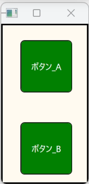
→
ボタン_A
タップ
ボタン_A
タップ
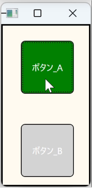
→
ボタン_A
タップ
2回目
ボタン_A
タップ
2回目
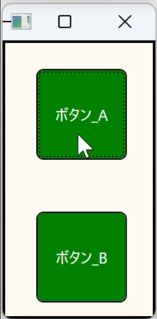
次のコードをそれぞれ該当するファイルに記述します。
- MainWindow.xml.cs
ボタンAのクリックで,ボタンBのIsEnabledを変更します。
private void ButtonA_ChangeButtonB_Click(object sender, RoutedEventArgs e) { Button_B.IsEnabled = !Button_B.IsEnabled; } - MainWindowDictionary.xaml
自身のIsEnabledをトリガーにして自身の背景色を変更します。
<Style x:Key="triggers_buttonB_style" TargetType="Button" BasedOn="{StaticResource squair_button_style}"> <Style.Triggers> <DataTrigger Binding="{Binding IsEnabled, ElementName=Button_B}" Value="True"> <Setter Property="Background" Value="Green" /> </DataTrigger> <DataTrigger Binding="{Binding IsEnabled, ElementName=Button_B}" Value="False"> <Setter Property="Background" Value="LightGray" /> </DataTrigger> </Style.Triggers> </Style> - MainWindow.xml
<Button x:Name="Button_A" Content="ボタン_A"
        Click="ButtonA_ChangeButtonB_Click"
        Template="{StaticResource radius_button}"/>

<Button x:Name="Button_B" Content="ボタン_B"
        Style="{StaticResource triggers_buttonB_style}"
        Template="{StaticResource radius_button}"/>
今回は以上となります。
お疲れさまでした。
C# チップ : ResourceDictionary 編 その2 「角の丸いボタン」を例として ー ControlTemplate ー
四角形のボタンはトゲトゲしているので,角の丸いボタンにしたい。と思うことはありませんか?
検索していて,やっぱり StackOverFlow でこんなに簡単なの?!というのを見つけることができました。
Border タグを使って角丸を表現し,ControlTemplate でボタンの構造と動作を定義します。
詳しいことは下記の説明を参考にしてみてください。
角の丸いボタンの定義
ControlTemplateの定義はリソースディクショナリに記述します。リソースディクショナリの作成方法は「C# チップ : ResourceDictionary 編 その1 ー Style ー - denpoyaのブログ」を参考にしてみてください。
<!-- 角の丸い Button Template -->
<ControlTemplate TargetType="Button" x:Key="radius_button">
    <Border CornerRadius="5"
            BorderThickness="1"
            BorderBrush="Black"
            Background="{TemplateBinding Background}">
        <ContentPresenter VerticalAlignment="Center"
                          HorizontalAlignment="Center" />
    </Border>
</ControlTemplate>
こちらは,Button コントロールをターゲットとした定義ですので,ToggleButton コントロールには使えません。TargetType を ToggleButton に指定した定義が必要です。
角の丸いボタンを作る
Button コントロールに Template プロパティを記述します。
Template="{DynamicResource radius_button}"Button コントロールはこんな感じになります。
<Button x:Name="RadiusButton" Content="角丸ボタン"
        Style="{DynamicResource normal_button_style}"
        Template="{DynamicResource radius_button}"/>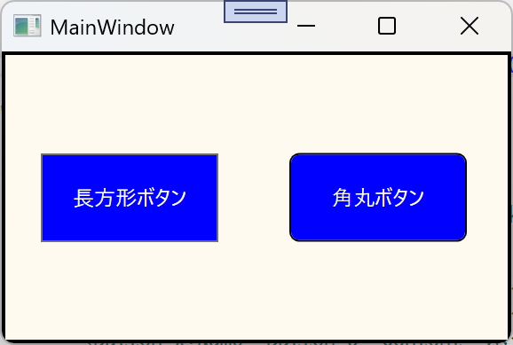
今回は以上となります。
お疲れさまでした。
C# チップ : ResourceDictionary 編 その1 ー Style ー
例えばボタンがいろんなところにたくさんあって,ボタンの統一感を出すためにサイズとかBackgroundとかを統一したい。と思ったりしませんか?
個々にStyleを記述していては,修正するときに修正漏れとか起こりそうですね。
そんな時は,リソースディクショナリを活用するのはどうでしょう。リソースディクショナリを修正するだけで複数個所に反映され,修正漏れがなくなると思います。
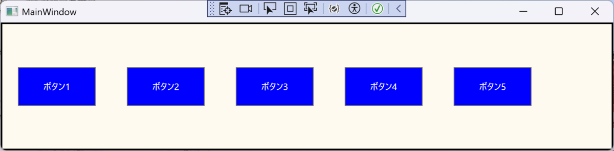
美しくないソースがこちら
<StackPanel Orientation="Horizontal">

    <Button x:Name="Button_1" Content="ボタン1" Height="50" Width="100" Margin="20" Background="Blue" Foreground="White"/>
    <Button x:Name="Button_2" Content="ボタン2" Height="50" Width="100" Margin="20" Background="Blue" Foreground="White"/>
    <Button x:Name="Button_3" Content="ボタン3" Height="50" Width="100" Margin="20" Background="Blue" Foreground="White"/>
    <Button x:Name="Button_4" Content="ボタン4" Height="50" Width="100" Margin="20" Background="Blue" Foreground="White"/>
    <Button x:Name="Button_5" Content="ボタン5" Height="50" Width="100" Margin="20" Background="Blue" Foreground="White"/>

</StackPanel>
リソースディクショナリを作成する
リソースディクショナリを外部ファイルとして作成し,他のWindowやユーザコントロールなどからも利用できるようにします。ここでは,プロジェクトのルートに「MainWindowDictionary.xaml」ファイルを作成することにします。
- ソリューションエクスプローラでリソースディクショナリファイルを保存したいプロジェクトまたはフォルダを選択し,右クリックメニューを表示します。
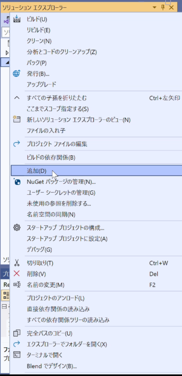
ソリューションエクスプローラで右クリックメニュー - 「追加」を選択
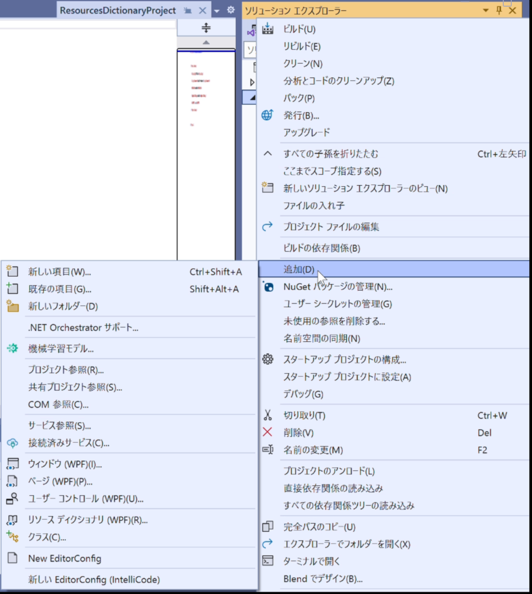
「追加」のメニューを表示 - 「リソースディクショナリ(WPF)」を選択
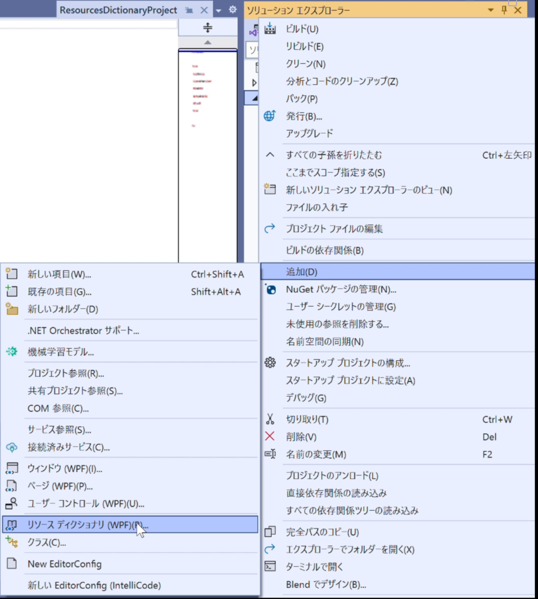
「リソースディクショナリ(WPF)」を選択 - リソースディクショナリが選択された状態で「新しい項目の追加」Windowが開きます。
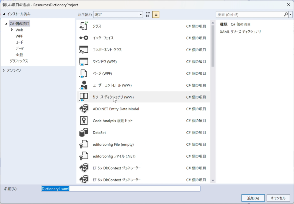
「新しい項目の追加」で「リソースディクショナリ」を追加する - ファイル名を付け,「追加」をタップすれば,ファイルが作成されます。

ファイルが作成される
ボタンのStyleを定義する
MainWindowDictionary.xaml に以下のコードを記述します。
<Style x:Key="normal_button_style" TargetType="Button">
    <Style.Setters>
        <Setter Property="Height"  Value="50" />
        <Setter Property="Width"  Value="100" />
        <Setter Property="Margin"  Value="20" />
        <Setter Property="Background"  Value="Blue" />
        <Setter Property="Foreground"  Value="White" />
    </Style.Setters>
</Style>
ボタンのStyleを各ボタンに反映させる
MainWindowDictionary.xaml ファイルを MainWindow.xaml に読み込ませるために, MainWindow.xaml に次のコードを記述します。
<Window.Resources>
    <ResourceDictionary Source="./MainWindowDictionary.xaml"/>
</Window.Resources>
各ボタンのStyleプロパティを次のように記述して,不要なプロパティを取り除きます。
<Button x:Name="Button_1" Content="ボタン1"
        Style="{DynamicResource normal_button_style}"/>
今回のソース
- MainWindowDictionary.xaml
<ResourceDictionary xmlns="http://schemas.microsoft.com/winfx/2006/xaml/presentation" xmlns:x="http://schemas.microsoft.com/winfx/2006/xaml"> <Style x:Key="normal_button_style" TargetType="Button"> <Style.Setters> <Setter Property="Height" Value="50" /> <Setter Property="Width" Value="100" /> <Setter Property="Margin" Value="20" /> <Setter Property="Background" Value="Blue" /> <Setter Property="Foreground" Value="White" /> </Style.Setters> </Style> </ResourceDictionary> - MainWindow.xaml
<Window x:Class="ResourcesDictionaryProject.MainWindow"
        xmlns="http://schemas.microsoft.com/winfx/2006/xaml/presentation"
        xmlns:x="http://schemas.microsoft.com/winfx/2006/xaml"
        xmlns:d="http://schemas.microsoft.com/expression/blend/2008"
        xmlns:mc="http://schemas.openxmlformats.org/markup-compatibility/2006"
        xmlns:local="clr-namespace:ResourcesDictionaryProject"
        mc:Ignorable="d"
        Background="FloralWhite"
        Title="MainWindow" Height="200" Width="800">

    <Window.Resources>
        <ResourceDictionary Source="./MainWindowDictionary.xaml"/>
    </Window.Resources>

    <Border BorderThickness="2" BorderBrush="Black">
        <StackPanel Orientation="Horizontal">

            <Button x:Name="Button_1" Content="ボタン1" Style="{DynamicResource normal_button_style}"/>
            <Button x:Name="Button_2" Content="ボタン2" Style="{DynamicResource normal_button_style}"/>
            <Button x:Name="Button_3" Content="ボタン3" Style="{DynamicResource normal_button_style}"/>
            <Button x:Name="Button_4" Content="ボタン4" Style="{DynamicResource normal_button_style}"/>
            <Button x:Name="Button_5" Content="ボタン5" Style="{DynamicResource normal_button_style}"/>

        </StackPanel>
    </Border>
</Window>
今回は以上となります。
お疲れさまでした。
C# チップ : ViewBox [LabelやTextBlock,TextBoxなどの文字サイズを自動調整]
Visual StudioでWindowsアプリを作り始めたころ,アプリをタブレットPCで動かすのなら全画面表示したいだろうし,デスクトップPCならMainWindowのサイズを可変にしたい。と考えた時,表示している文字の大きさもMainWindowのサイズに合わせて可変でいてくれたらいいのに,と思っていました。
幾度も検索をして,TextBlockの縦横サイズからフォントサイズを計算をするような猛者の方もいらっしゃいましたが,ようやっとStackOverFlowでその答えを見つけた時には,やっぱあるじゃん!となりました。
ViewBox コントロール
ViewBox コントロールは,外側のコントロールサイズに合わせて,内側のコントロールのサイズを最大まで大きく表示してくれます。
以下 Label を例として扱いますが,TextBlock や TextBox でも同様です(Label は他のコントロールとは少し異なる挙動をするという印象なのであえて選んでみました。TextBlock や TextBoxの場合の挙動はご自身で確かめてみてください)。
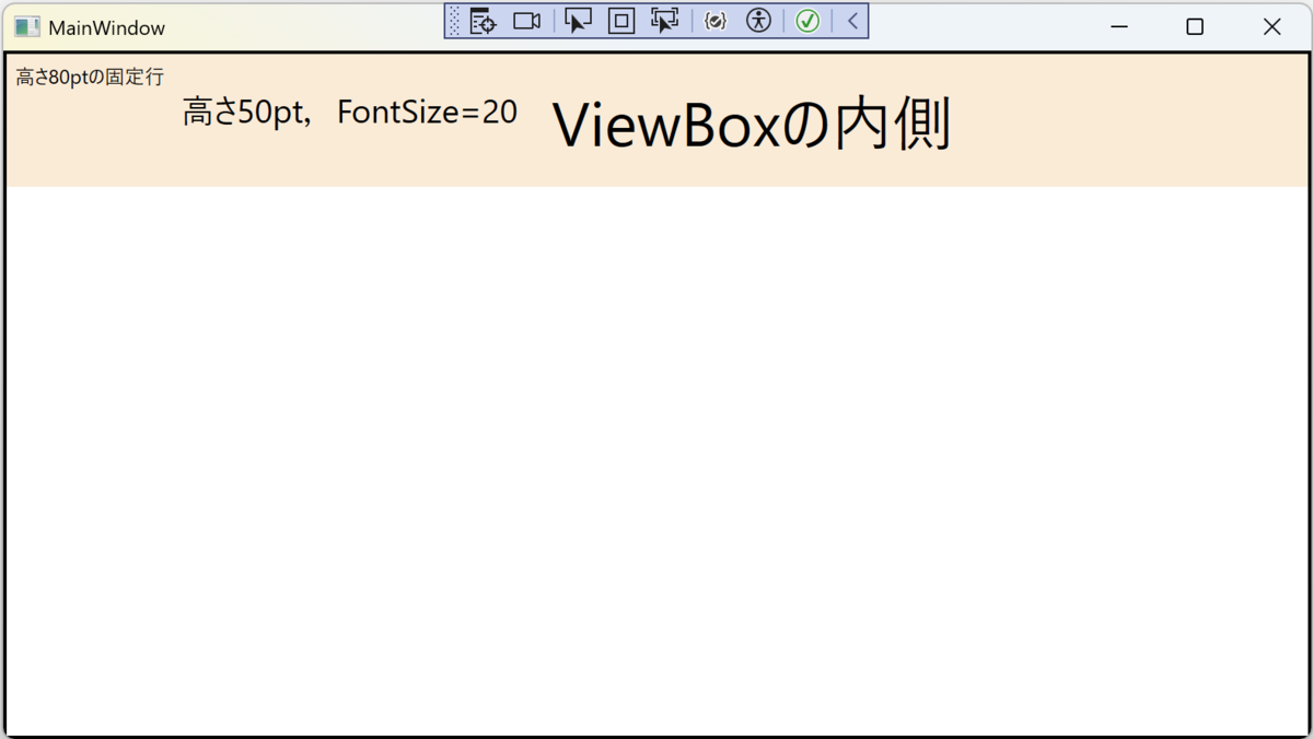
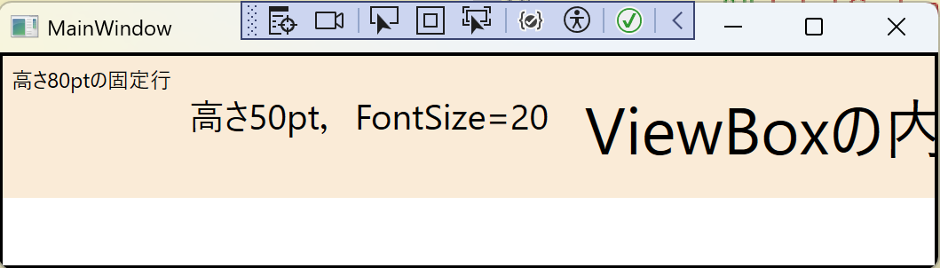
<StackPanel Orientation="Horizontal">
    <Label Content="高さ80ptの固定行"/>

    <Label Content="高さ50pt,FontSize=20" Height="50"  FontSize="20"/>

    <Viewbox>
        <Label Content="ViewBoxの内側"/>
    </Viewbox>

</StackPanel>
例1は,Gridで3行定義したうちの一行目で,高さを80ptに固定しています。
MainWindowを縮小しても行の高さが変わらないので,LabelのサイズもViewBoxの内側のサイズも変わっていません。
<Grid.RowDefinitions>
    <RowDefinition Height="80"/>
    <RowDefinition Height="*"/>
    <RowDefinition Height="2*"/>
</Grid.RowDefinitions>
1行目と全く同じものを2行目と3行目にコピーしてMainWindowのサイズを変えてみます。
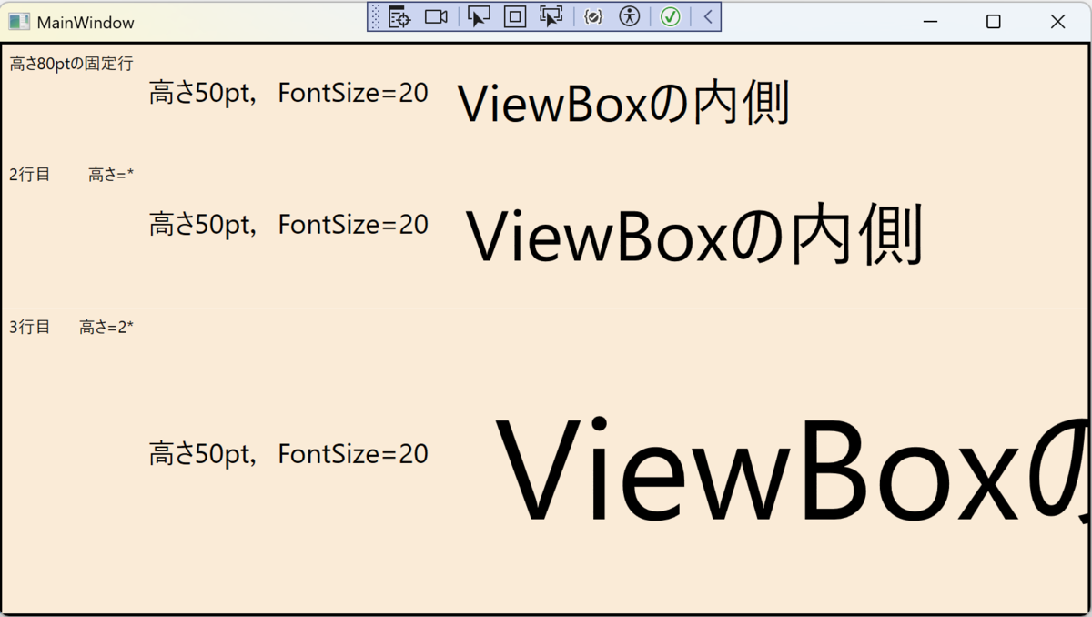
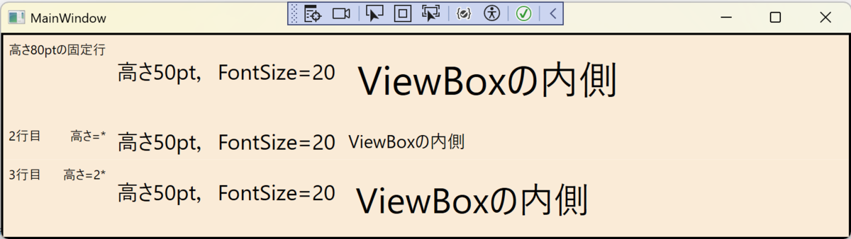
例1,例2では,StackPanelを使っていることもあり,Labelの横幅はStackPanelの横幅(=Gridの横幅 = MainWindowの横幅)に縛られることなくはみ出ています(Labelの横幅はContentで決められているのかな?という印象です)。
そこで,<DockPanel LastChildFill="True">でやってみます。
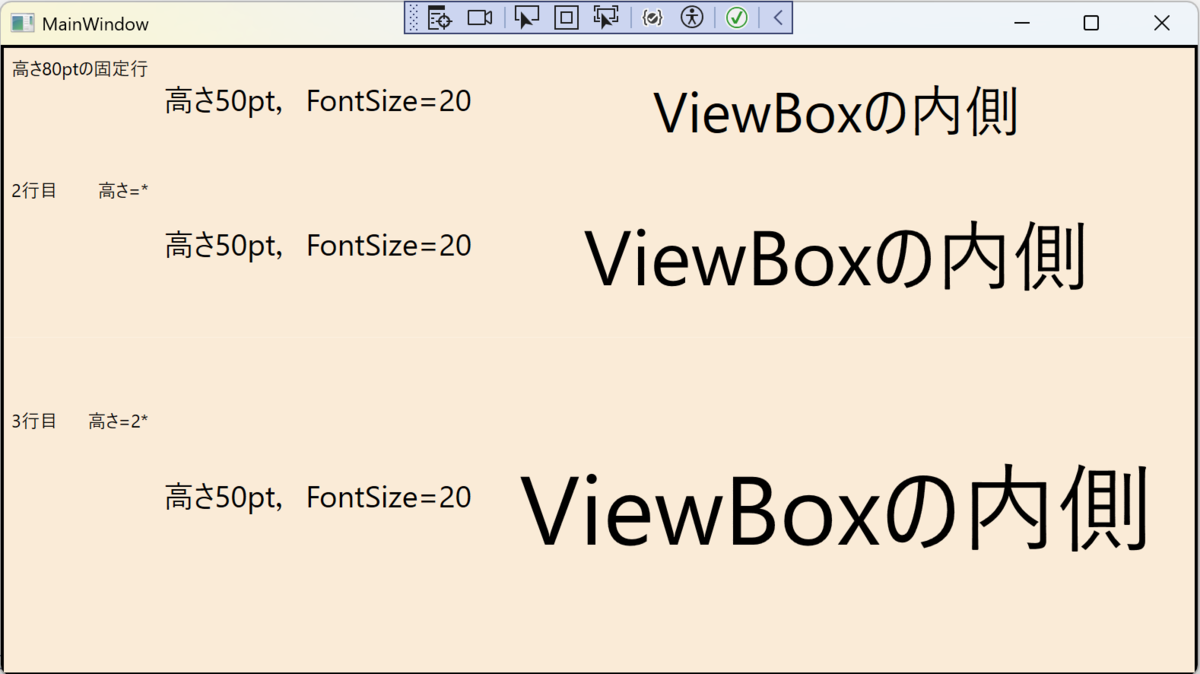
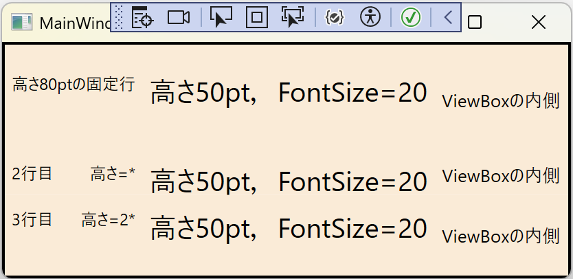
最後に,例3のコードを書いておきます。
    <Border BorderThickness="2" BorderBrush="Black">
        <Grid>
            <Grid.RowDefinitions>
                <RowDefinition Height="80"/>
                <RowDefinition Height="*"/>
                <RowDefinition Height="2*"/>
            </Grid.RowDefinitions>

            <Border Grid.Row="0">

                <DockPanel LastChildFill="True">
                    <Label Content="高さ80ptの固定行"/>

                    <Label Content="高さ50pt,FontSize=20" Height="50"  FontSize="20"/>

                    <Viewbox>
                        <Label Content="ViewBoxの内側"/>
                    </Viewbox>

                </DockPanel>
            </Border>

            <Border Grid.Row="1">

                <DockPanel LastChildFill="True">
                    <Label Content="2行目        高さ=*"/>

                    <Label Content="高さ50pt,FontSize=20" Height="50"  FontSize="20"/>

                    <Viewbox>
                        <Label Content="ViewBoxの内側"/>
                    </Viewbox>

                </DockPanel>
            </Border>

            <Border Grid.Row="2">

                <DockPanel LastChildFill="True">
                    <Label Content="3行目      高さ=2*"/>

                    <Label Content="高さ50pt,FontSize=20" Height="50"  FontSize="20"/>

                    <Viewbox>
                        <Label Content="ViewBoxの内側"/>
                    </Viewbox>

                </DockPanel>
            </Border>
        </Grid>
    </Border>
今回は以上となります。
お疲れさまでした。
WSLチップ : WSL バージョン1をバージョン2へコンバートする
既存のWSL1ディストロをWSL2へアップデートしたい。
コマンド: PowerShell かコマンドプロンプトで実行
wsl --set-version Debian 2
書式: wsl --set-version <ディストロ名> <変更したいバージョン番号>
確認
wsl -l --verbose
OK
WSLチップ : Linux側ファイルをnotepadで編集する
Linux側のファイルシステムにアクセスするにはネットワーク接続経由のパスを使えば良いので、
- ネットワーク接続経由のパスは「//wsl$/「ディストロ名」/ファイルパス」のように記述
コマンド: PowerShell かコマンドプロンプトで実行
notepad.exe //wsl$/Debian/home/ユーザー名/.bashrc
以上です。
WSLチップ : Linux側ファイルをエクスプローラーで表示する
言葉で説明すると、
- Linux側からpowershell.exeを使ってカレントディレクトリ「.」を引数にstartすることでエクスプローラーを起動する
コマンド: Linux側端末で実行
\\wsl$\Debian\home\ユーザー名
となっていて(「.」がホームディレクトリだったので)、これはLinux側のファイルシステムにアクセスするにはネットワーク接続経由のパスを使っているんだそうだ。
ネットワーク接続経由のパスは「//wsl$/「ディストロ名」/ファイルパス」のように記述する。
Microsoftドキュメントを見ていると勉強になるなぁ〜。実際とは異なっていたりしたけど(上のコマンドは修正したので正しく動きます)、powershell.exeは、C:/Windows/System32/にはないんだよね(2020年12月現在、Windows10バージョン20H2において)。
あれ?直接エクスプローラーを起動すれば良いのでは?
コマンド: Linux側端末で実行
OKですね。
それならexplorerコマンドを作っておこう。
#! /bin/sh
/mnt/c/Windows/explorer.exe $1
コマンド: Linux側端末で実行、上記内容のファイルを作成し、実行権限を与えます。
sudo chmod +x /usr/local/bin/explorer
確認
explorer .
OKです。
